Tylenol DxP
One of the big project undertakings for our user experience team was DxP (digital experience platform) initiative—the migration of the Tylenol website from Johnson & Johnson’s platform to Kenvue’s—represented a significant opportunity to redefine the digital experience for our users. This wasn’t just a technical migration; it was a chance to strategically rebuild a core brand asset and ensuring it aligned with the evolving needs of Tylenol’s diverse user base. Understanding the complexities of our platform migration, we approached this project with a user-centered methodology, focusing on minimizing friction and maximizing usability during and after the transition. A key part of our strategy, demanded a deep understanding of user journeys, information architecture, and the seamless integration of design and technology to deliver an enhanced digital experience.
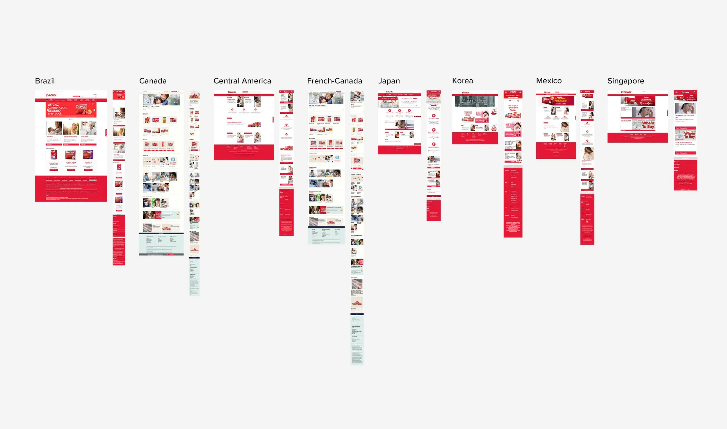
Global Market Audit
A critical phase of the DxP initiative involved a comprehensive global audit of Tylenol's existing stand-up sites across diverse markets, including countries such as Canada, Mexico, Brazil, Korea, and Singapore. This meticulous examination was essential to identify commonalities and divergences in user needs and design implementations. We each delved into our assigned market's site, analyzing content, functionality, and visual components to pinpoint elements that resonated universally. By dissecting user flows and content localization strategies, we aimed to uncover patterns that would inform the development of a cohesive, globally relevant brand website. This process involved not only technical audits but also cultural sensitivity assessments, so we ensure that the final design would respect regional nuances while maintaining a consistent brand identity. The goal was to distill the essence of Tylenol's digital presence, extracting reusable components and design principles that could be scaled across all markets, creating a unified and seamless user experience worldwide.
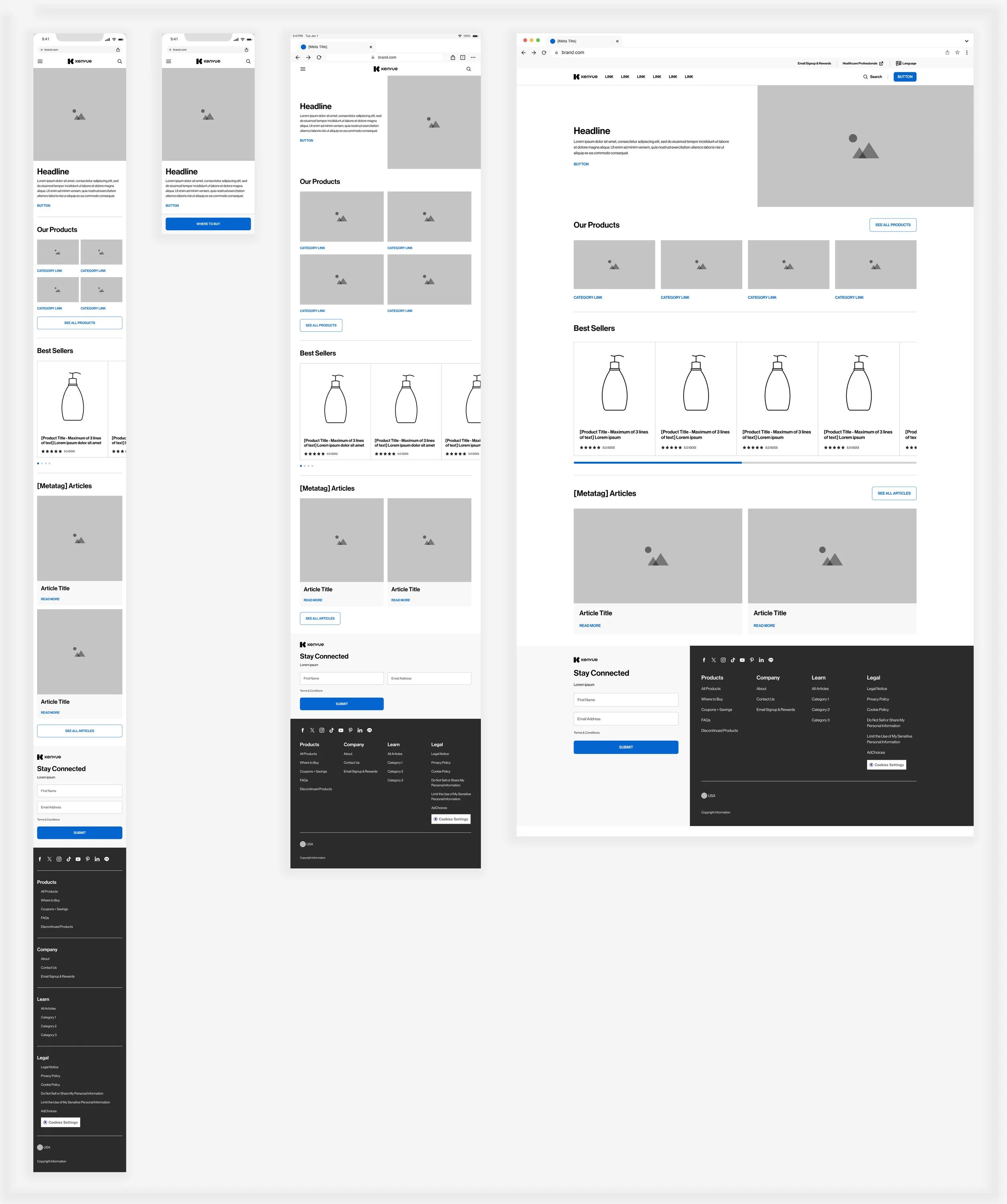
White Label Design System
Following the comprehensive global audits across diverse markets, our team embarked on a crucial phase: the development of a unified design system. This system, titled the 'White Label Design System,' was strategically created to ensure consistency and scalability across Kenvue’s extensive brand portfolio. It provided a flexible framework of templates and components, allowing each brand to maintain its unique identity while adhering to core design principles. Brand-specific design guidelines could be seamlessly integrated into this system to ensure visual cohesion while also capturing individual brand nuances. Recognizing the homepage as the primary point of entry, we initiated the design system's implementation with a focus on homepage templates. This allowed us to establish foundational design elements, patterns, interaction models, and ultimately, be adaptable for other Kenvue brands.
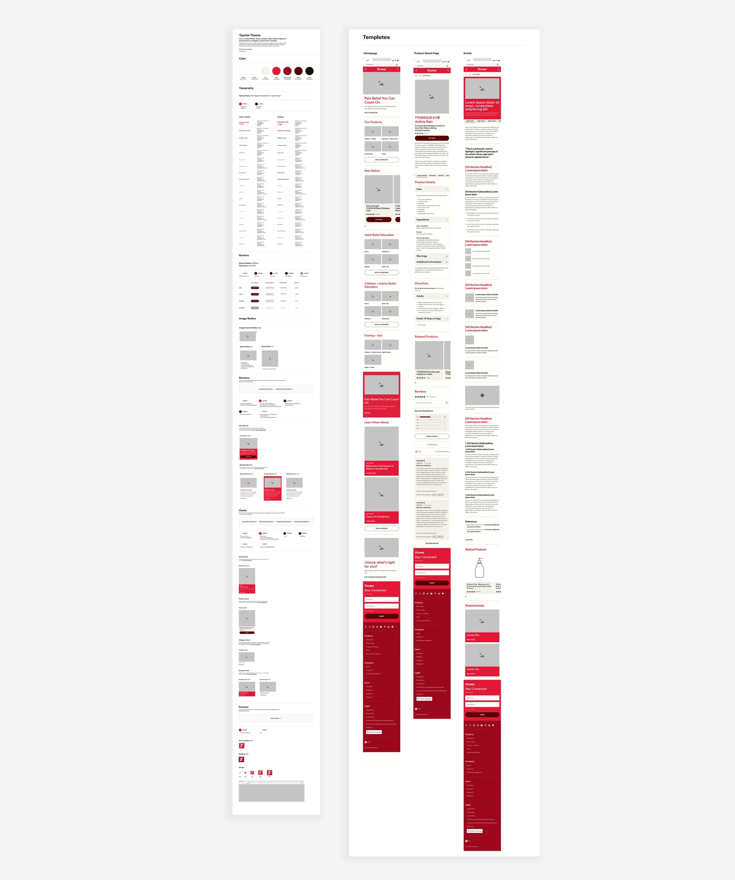
Tylenol Brand Guidelines
The development of the Tylenol brand design guidelines was a meticulous process, ensuring that core brand elements were seamlessly integrated. We defined and implemented brand-specific colors, typography, and call-to-action button styles, aligning with Tylenol's established visual identity. This involved a thorough analysis of existing brand assets and researching through our megabrand toolkit, allowing us to merge established brand recognition with todays web best practices. Through this due diligence, we were able to create a cohesive design language that maintained Tylenol's distinct character while adhering to the system's overarching principles. The integration of these brand-specific elements ensured that the Tylenol website would not only be functional and user-friendly but also a true reflection of the brand's identity, reinforcing its position within the Kenvue portfolio.
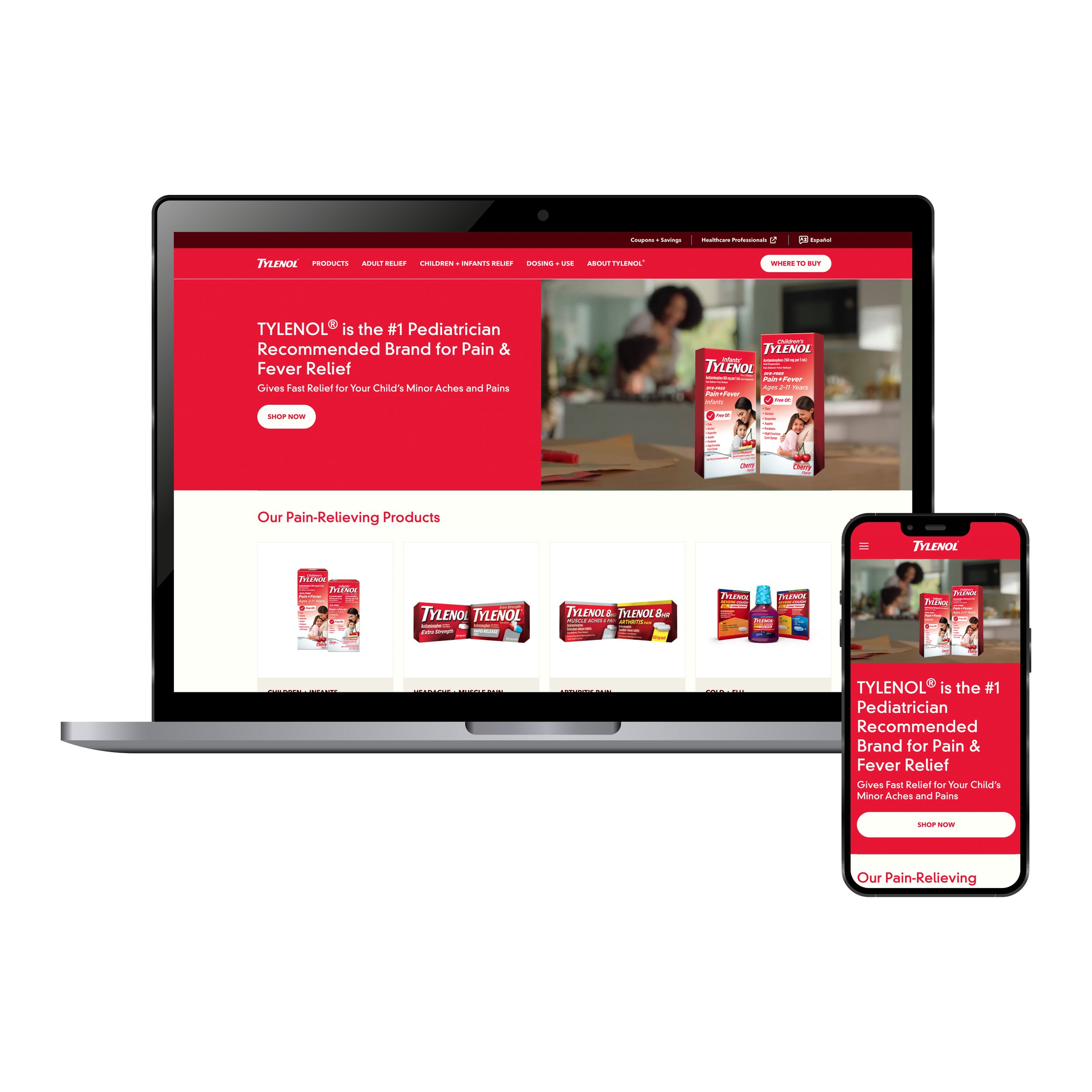
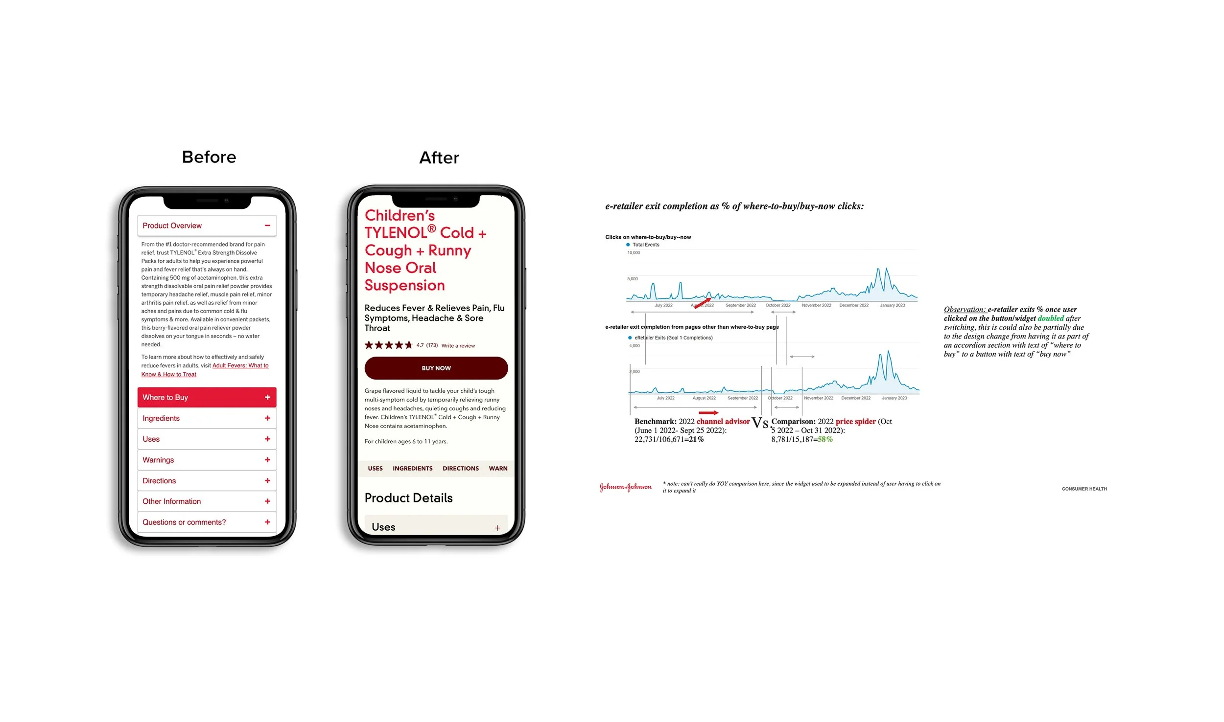
Small Changes, Big Difference
One critical area of improvement was the 'Where to Buy' call-to-action. Previously, this crucial functionality was relegated to an accordion component, burying it within a secondary layer of interaction. This design choice hindered users' ability to quickly locate and purchase Tylenol products, creating unnecessary friction in the conversion funnel. Recognizing the importance of this feature, we implemented a strategic redesign, exposing the 'Where to Buy' CTA as a prominent, standalone button. This seemingly small change yielded remarkable results. Analytics revealed a doubling of e-retailer exits, demonstrating the direct impact of improved visibility and accessibility. By prioritizing user needs and simplifying the purchasing process, we not only enhanced the overall user experience but also improved conversion rates, underscoring the power of thoughtful UI design.
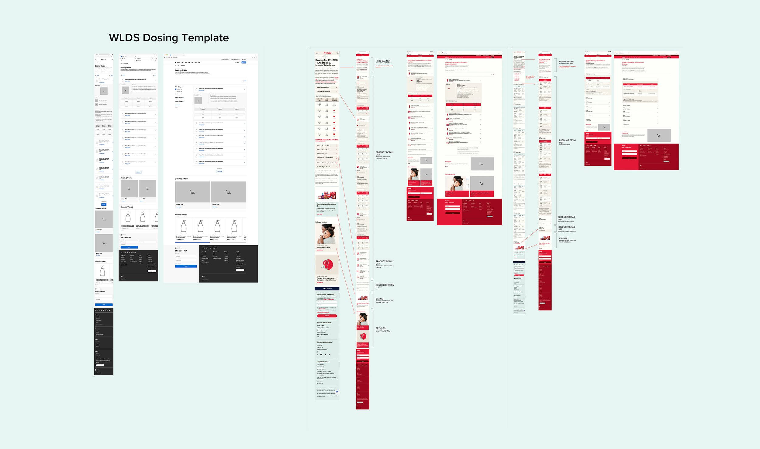
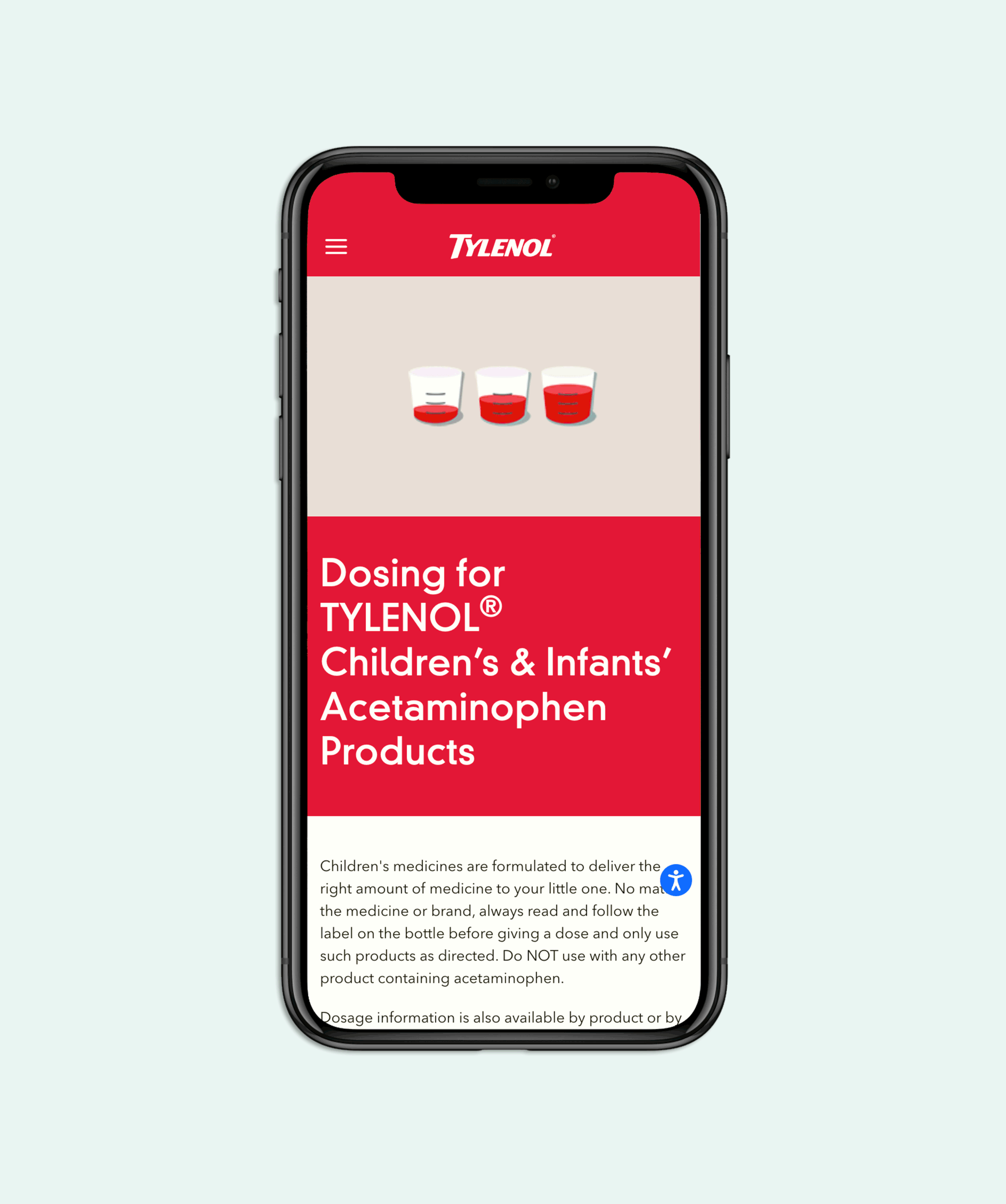
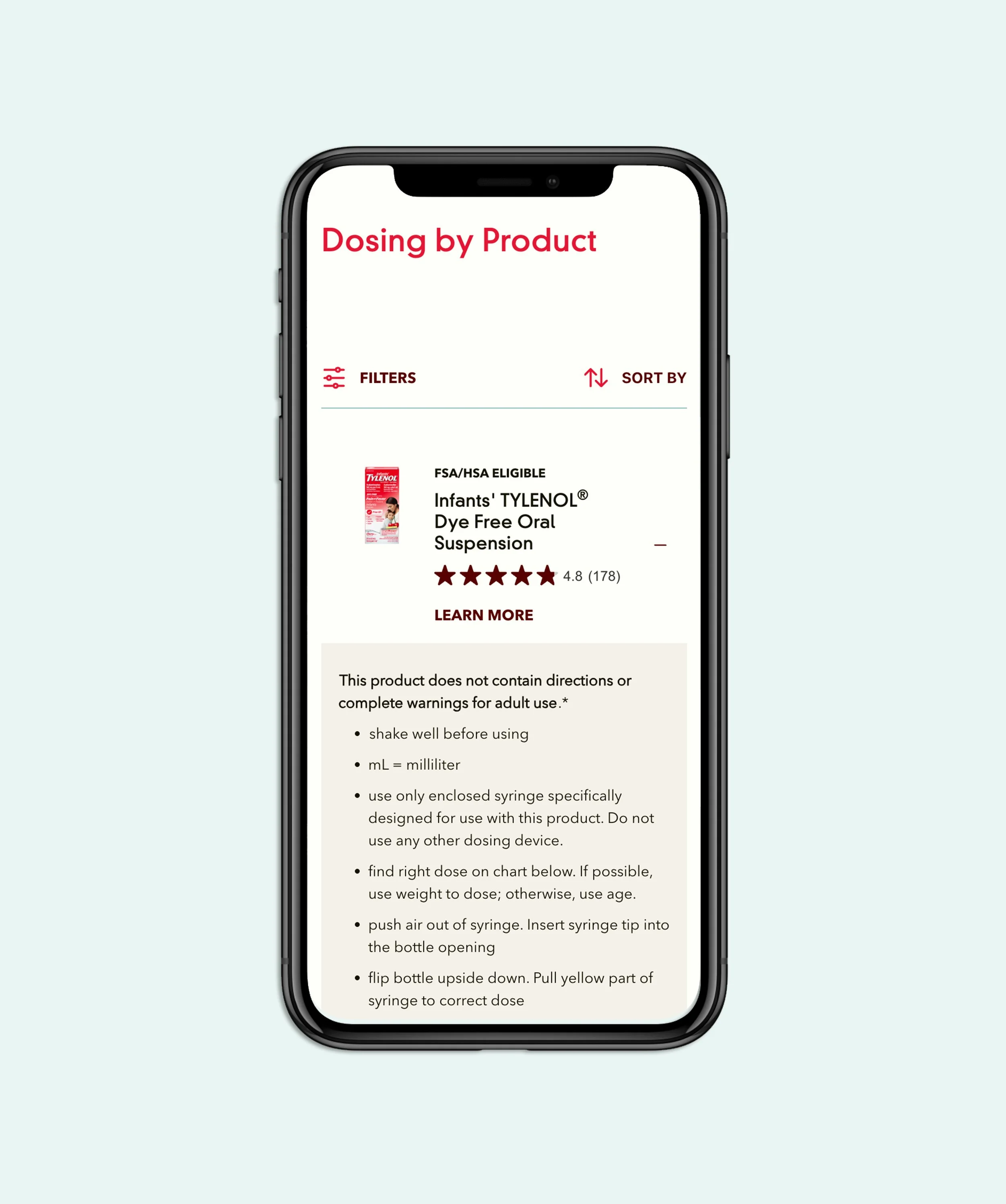
Dosing Landing Page
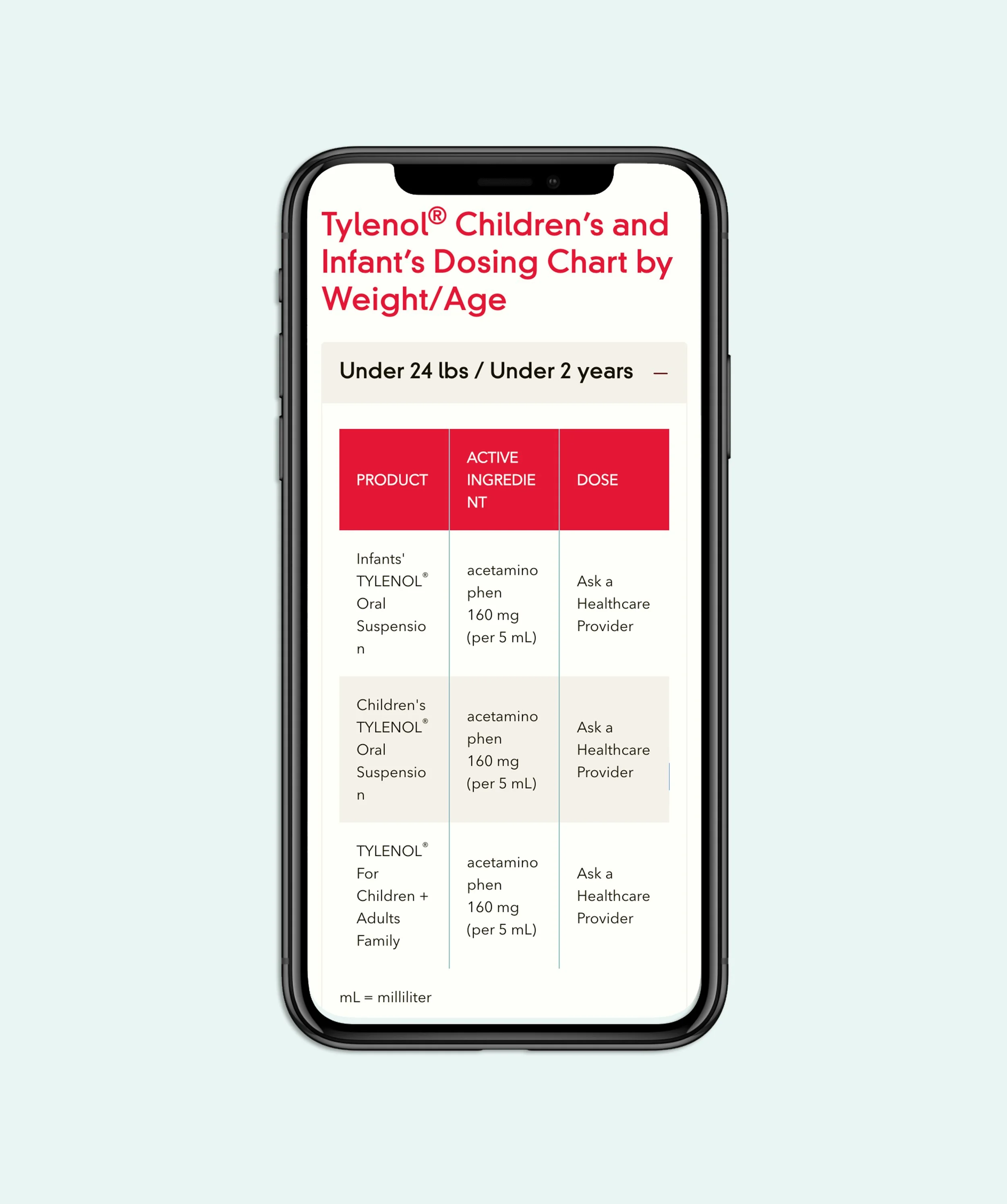
Our data analytics showed that the Children’s and Infants’ dosing page as one of the most frequently visited sections of our Tylenol website. We prioritized this enhancement within the DxP initiative by using the WLDS (White Label Design System) templates as a foundation and by doing so, we were able to swiftly identify the core components required for the dosing guide. This allowed us to focus on refining existing elements and integrating new features based on user needs. A significant improvement was the consolidation of the dosing information, combining dosage guidance by child’s weight and age, as well as by specific product, all onto a single, easily navigable landing page. By leveraging the consistency and flexibility of the WLDS, we transformed the dosing page into a more robust and user-friendly resource, directly addressing the high user demand for accurate and accessible dosage information.
-
Tylenol Children's and Infant's Dosing Landing Page
-
Dosing by Weight / Age
-
Dosing by Product
Learnings
In conclusion, the DxP initiative, encompassing the Tylenol website's platform migration and redesign, yielded significant learnings and improvements. Through our global audits, user-centered design, and the implementation of the White Label Design System, we successfully established a cohesive and scalable digital presence for Tylenol. Key findings, such as the impact of visible CTAs and the importance of a streamlined dosing page, reinforced the power of data-driven design and feedback. This project not only enhanced the user experience but also demonstrated the effectiveness of a unified design system in managing a diverse brand portfolio, setting a new standard for Kenvue's digital strategy.