Heal
Redesigned the internal operations dashboard for a healthcare startup delivering house calls and telemedicine. Overhauled a 20+ item navigation, built data-driven dashboards for provider management, and created a scalable design system from the ground up.
The Challenge
A complex operations tool that outgrew its interface
Heal's operations team managed house calls, telemedicine visits, provider scheduling, patient records, insurance claims, and market logistics all through a single internal tool. Over time, features had been added without a cohesive design strategy. The navigation had ballooned to 20+ items in a flat, ungrouped list. The existing dashboard lacked filtering and provided no quick way to drill into specific providers or markets.
Operations coordinators were juggling between the Ops tool, Google Sheets, Zingle, DrChrono, and multiple other platforms just to complete basic workflows. The analytics page showed raw data without actionable structure. The entire experience needed to be rethought from navigation to data visualization.


Discovery
Understanding the people behind the operations
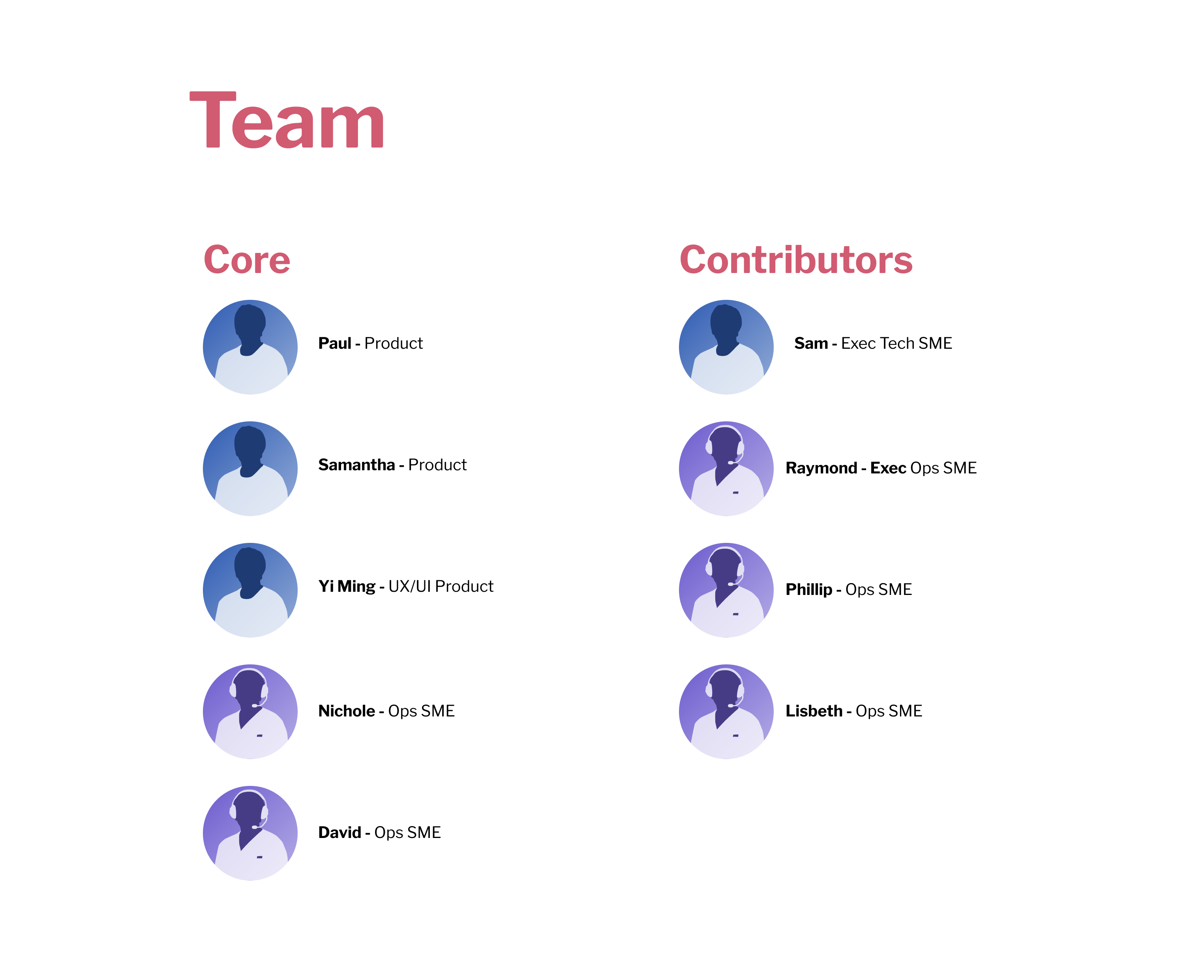
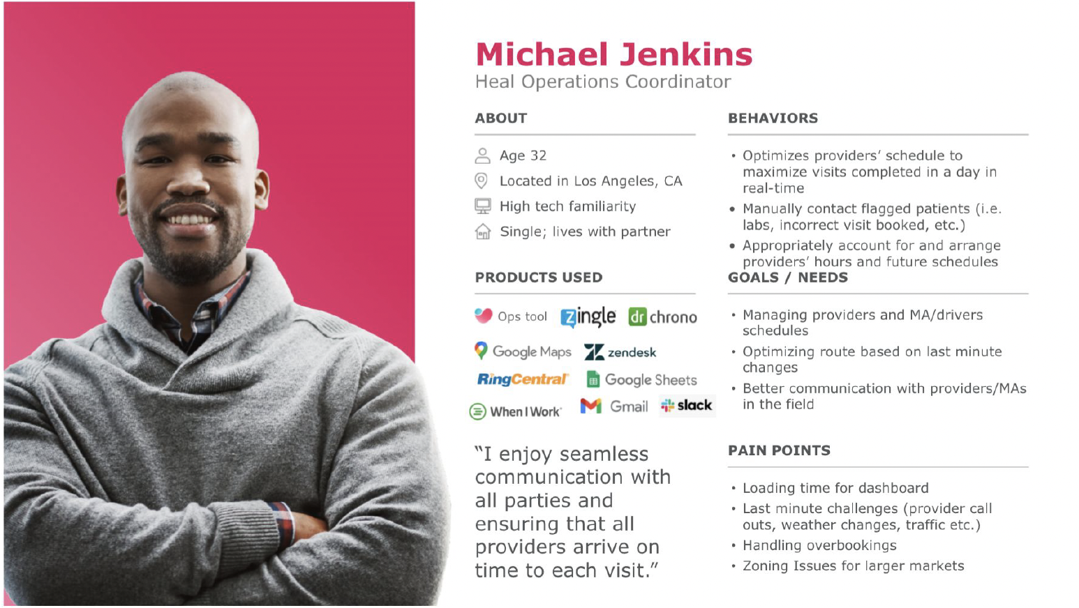
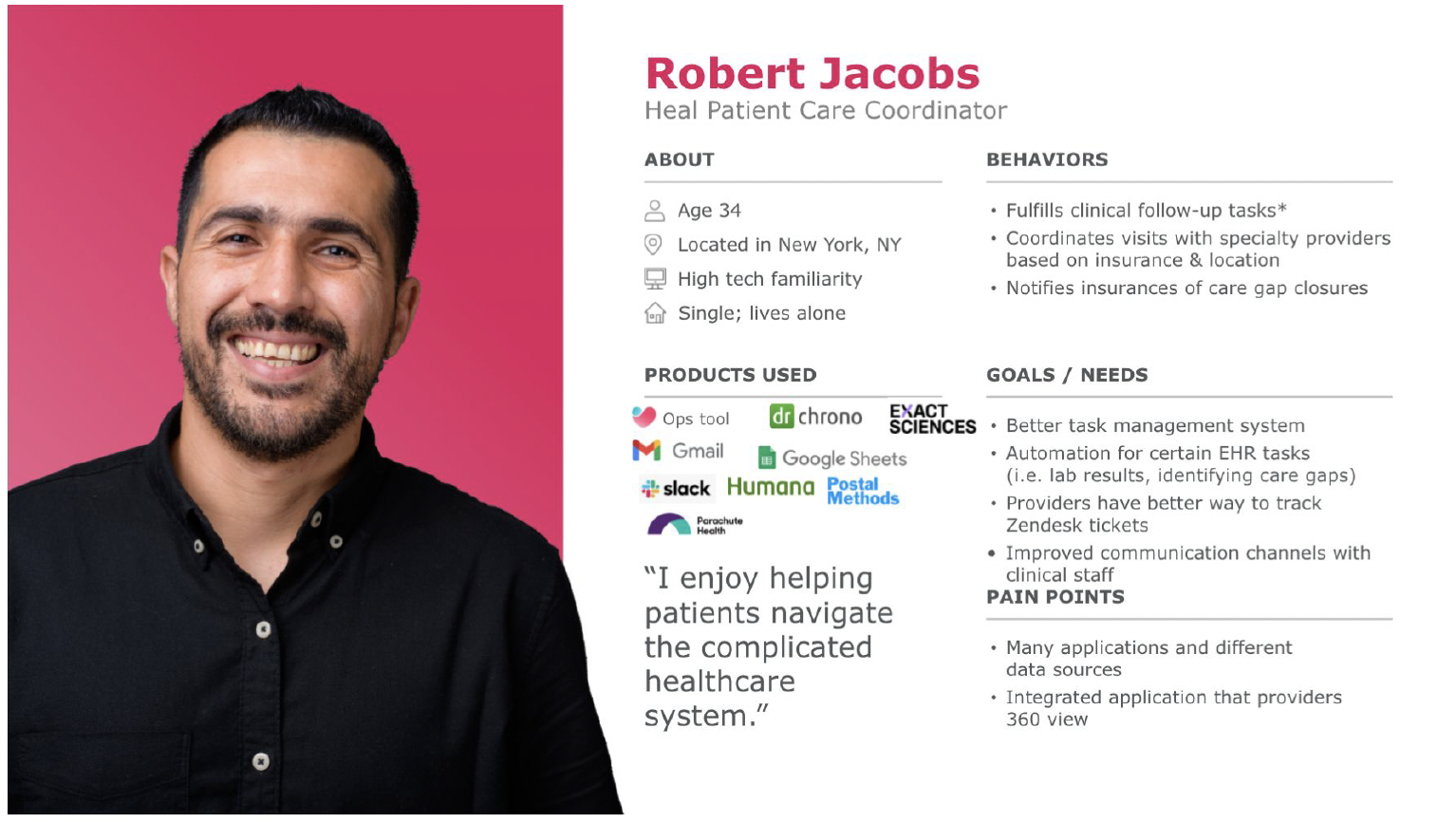
I worked within a 9-person cross-functional team: two product managers, myself as the sole UX/UI designer, and operations SMEs who served as both stakeholders and end users. To ground the redesign in real workflows, I developed two primary user personas based on interviews and observation sessions with the operations team.
Michael Jenkins, an Operations Coordinator, needed to optimize provider schedules and manage last-minute changes in real time. Robert Jacobs, a Patient Care Coordinator, focused on clinical follow-ups and insurance coordination across multiple platforms. Both shared a core pain point: too many tools, not enough integration.
Design System
UI/UX style guide
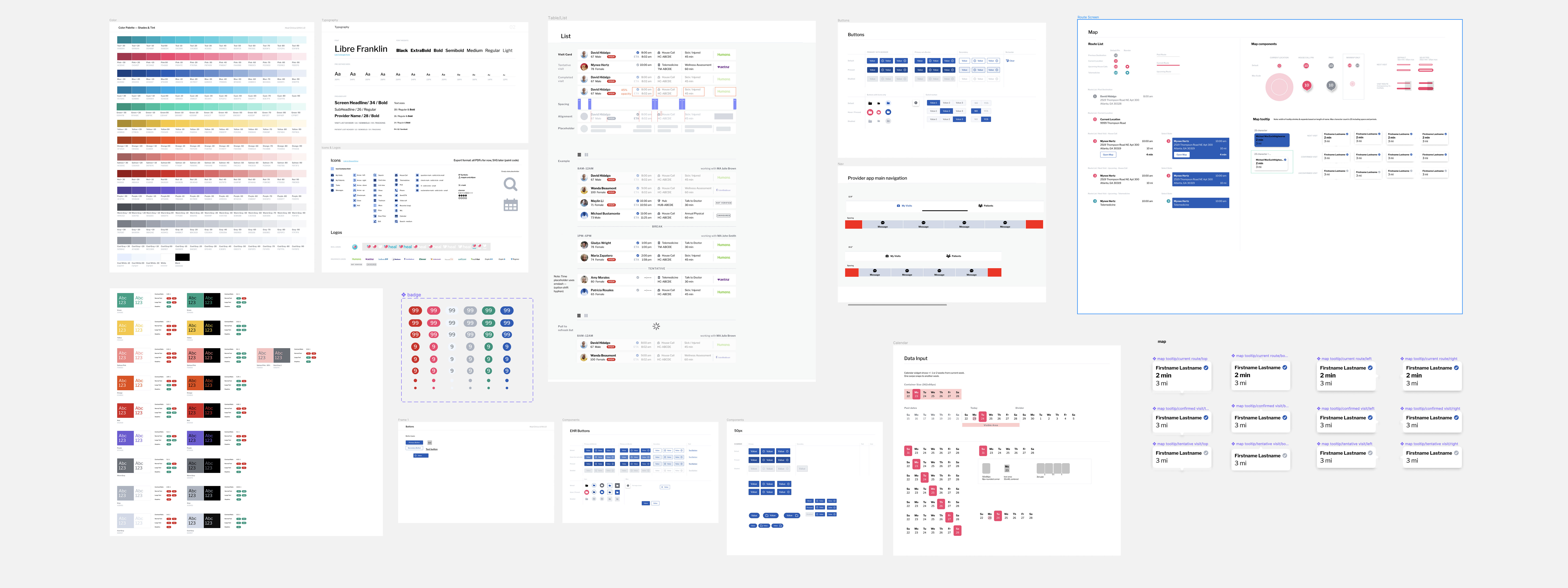
I built the complete design system from scratch: color palette with accessible contrast ratios, Libre Franklin typography scale, icon library, component patterns for lists, tables, filters, maps, buttons, badges, status indicators, and card layouts. Every component was designed for the dense, data-heavy context of an operations dashboard where information density matters but clarity cannot be sacrificed.
Key Redesign
Restructuring the navigation
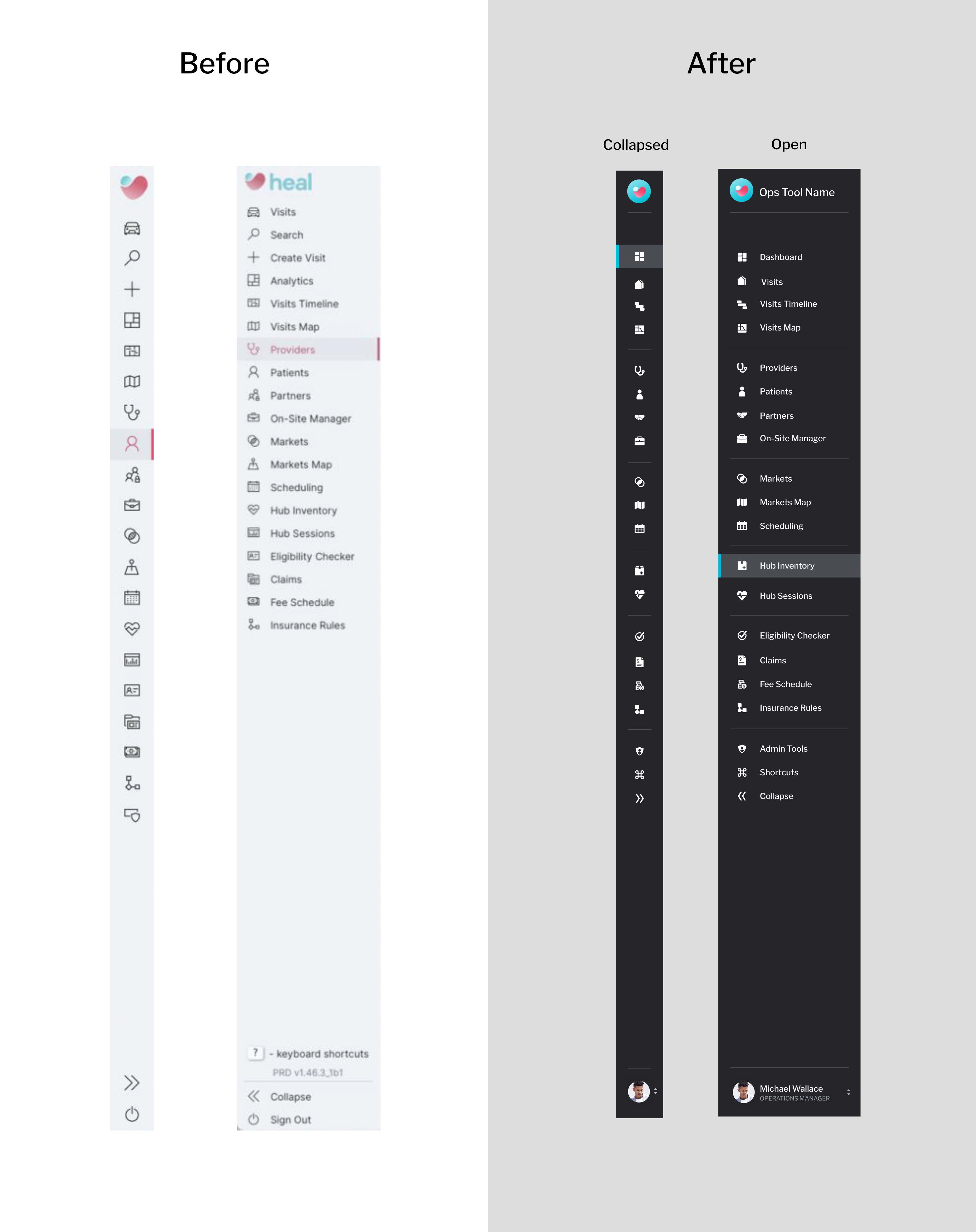
The existing navigation was a flat list of 20+ items with no grouping, no visual hierarchy, and inconsistent iconography. Users had to scan every item to find what they needed. Some features like "Keyboard Shortcuts" and "Sign Out" sat alongside primary tools, creating visual noise.
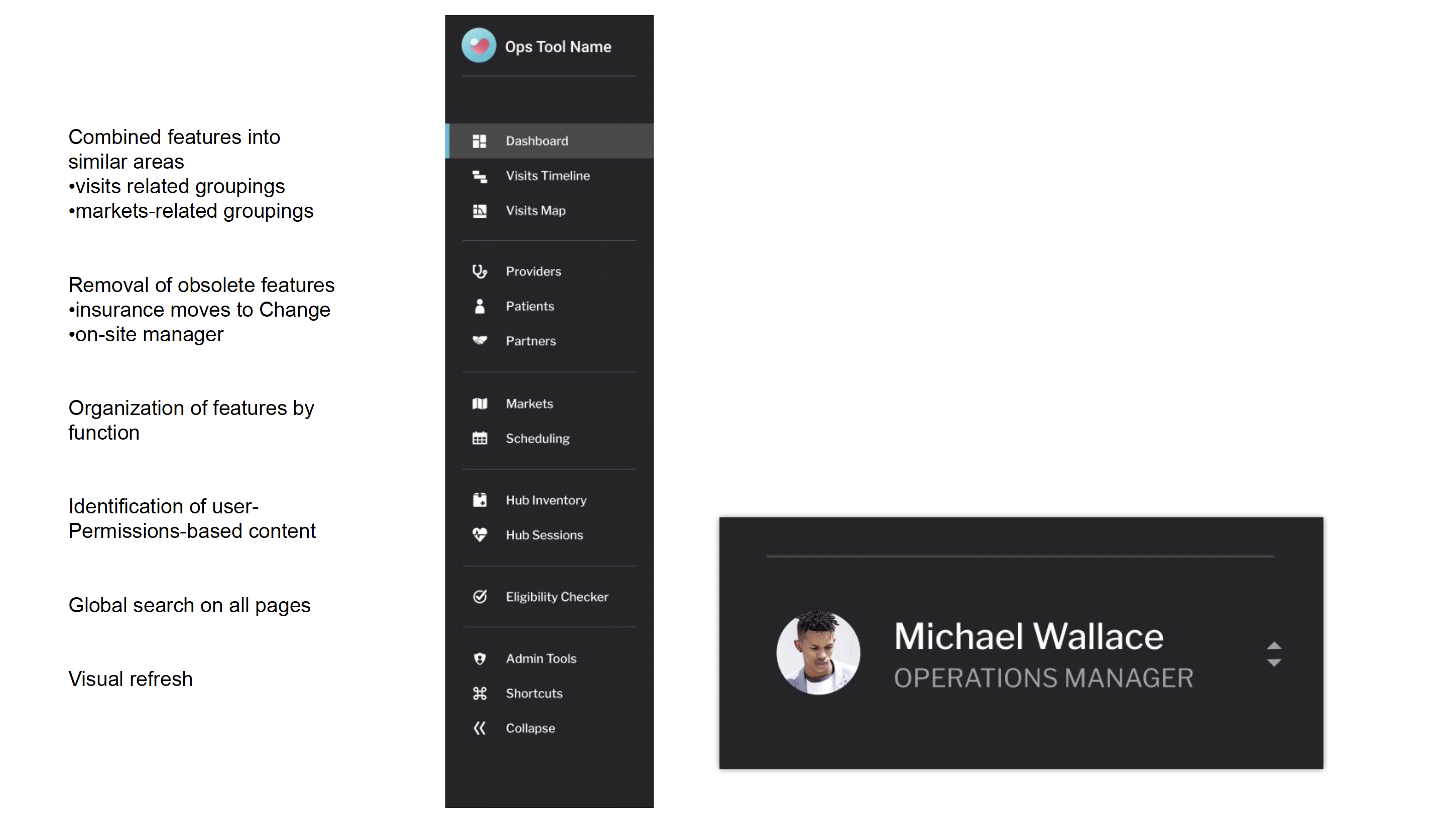
I reorganized the navigation into logical functional groups: visits-related pages together, people management grouped (providers, patients, partners), market operations clustered, hub logistics paired, and compliance tools bundled. Obsolete features were removed. Each group has clear visual separation. The redesigned sidebar supports both collapsed (icon-only) and expanded states, with a user profile section at the bottom showing role context.
Dashboard Design
A data-driven operations command center
The redesigned dashboard centralizes everything an operations coordinator needs: geographic view of provider locations, real-time visit statistics, patient satisfaction scores, drive time analytics, telemedicine trends, and provider arrival rates. Filters at the top let users drill down by state, market, provider, and time period. Selecting a specific provider updates the entire view to show that individual's metrics, patients, and house call locations.
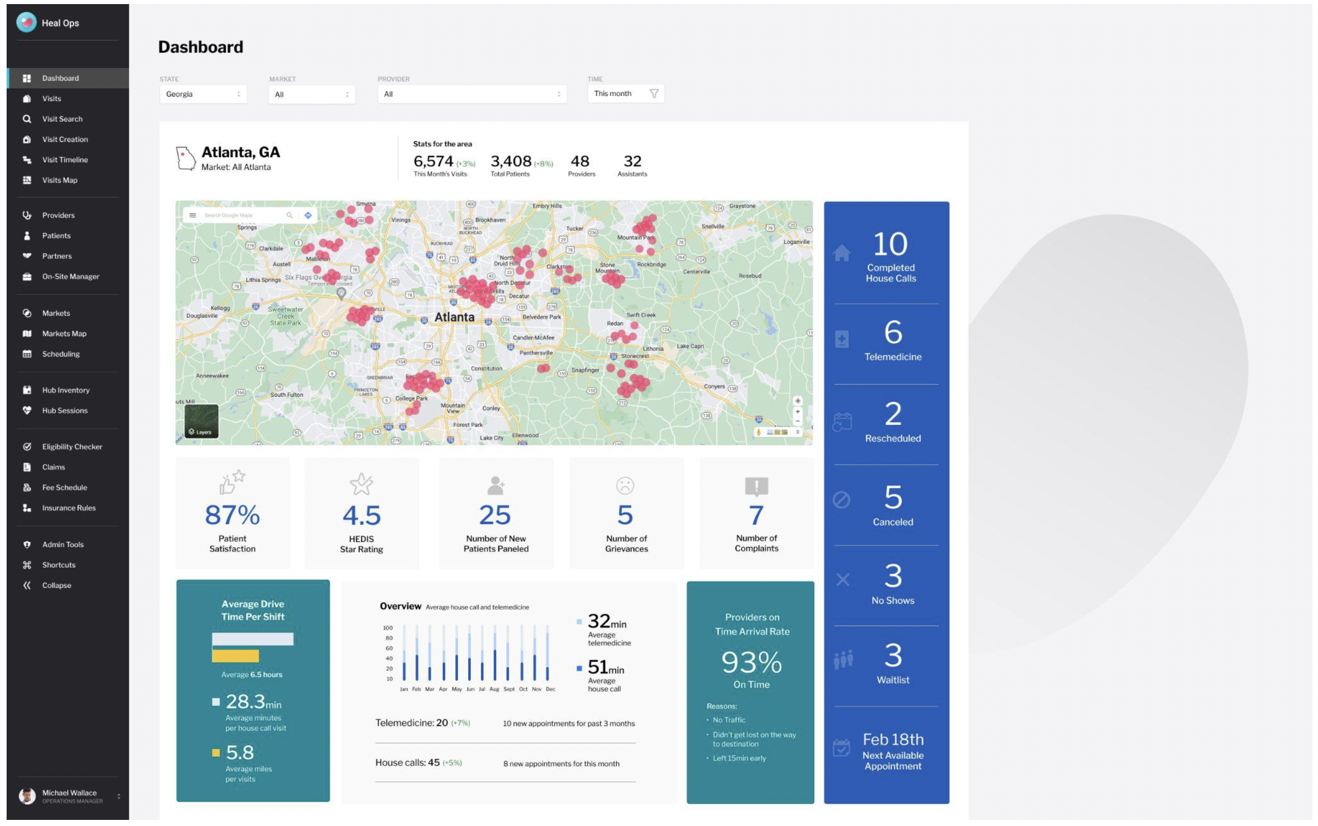
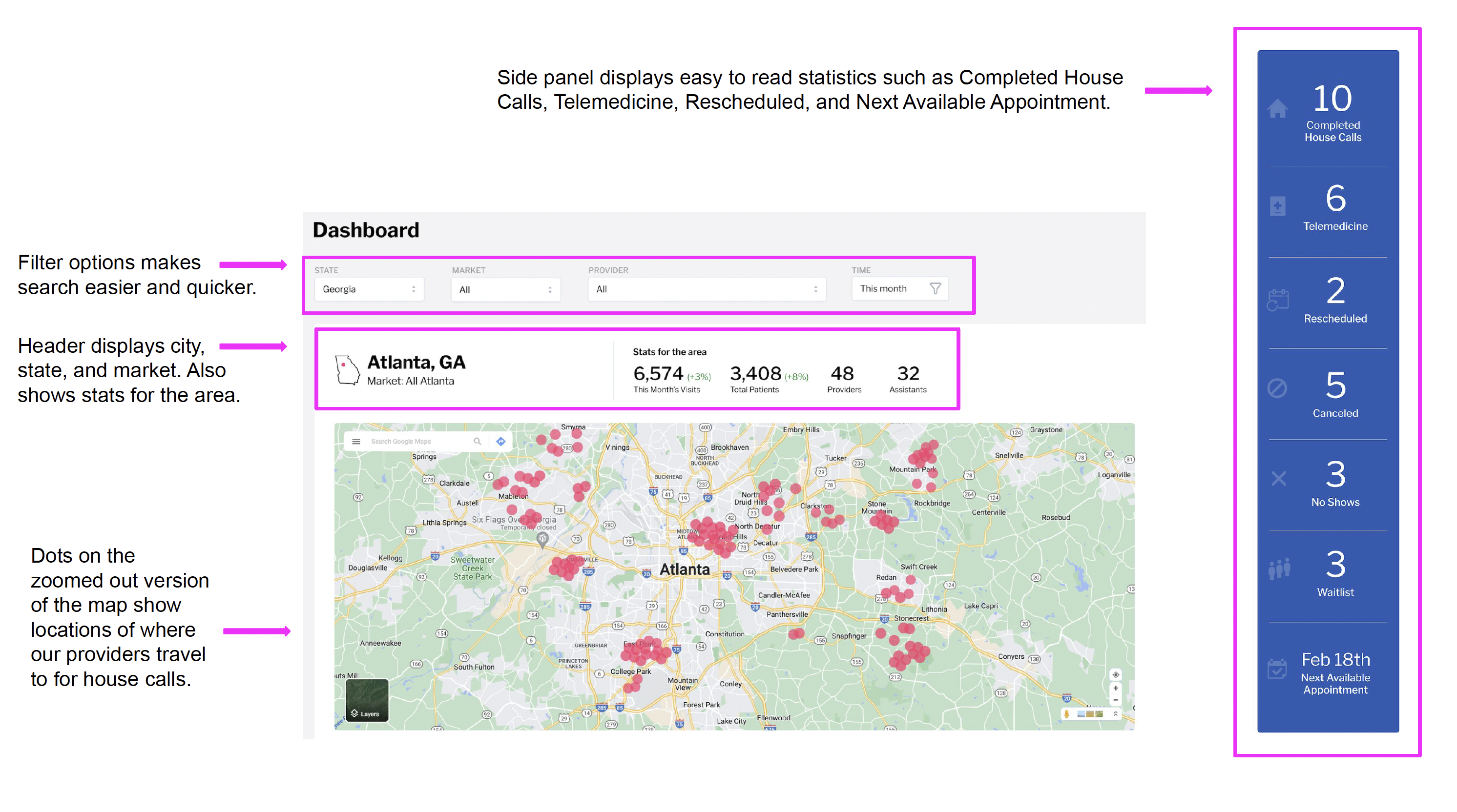
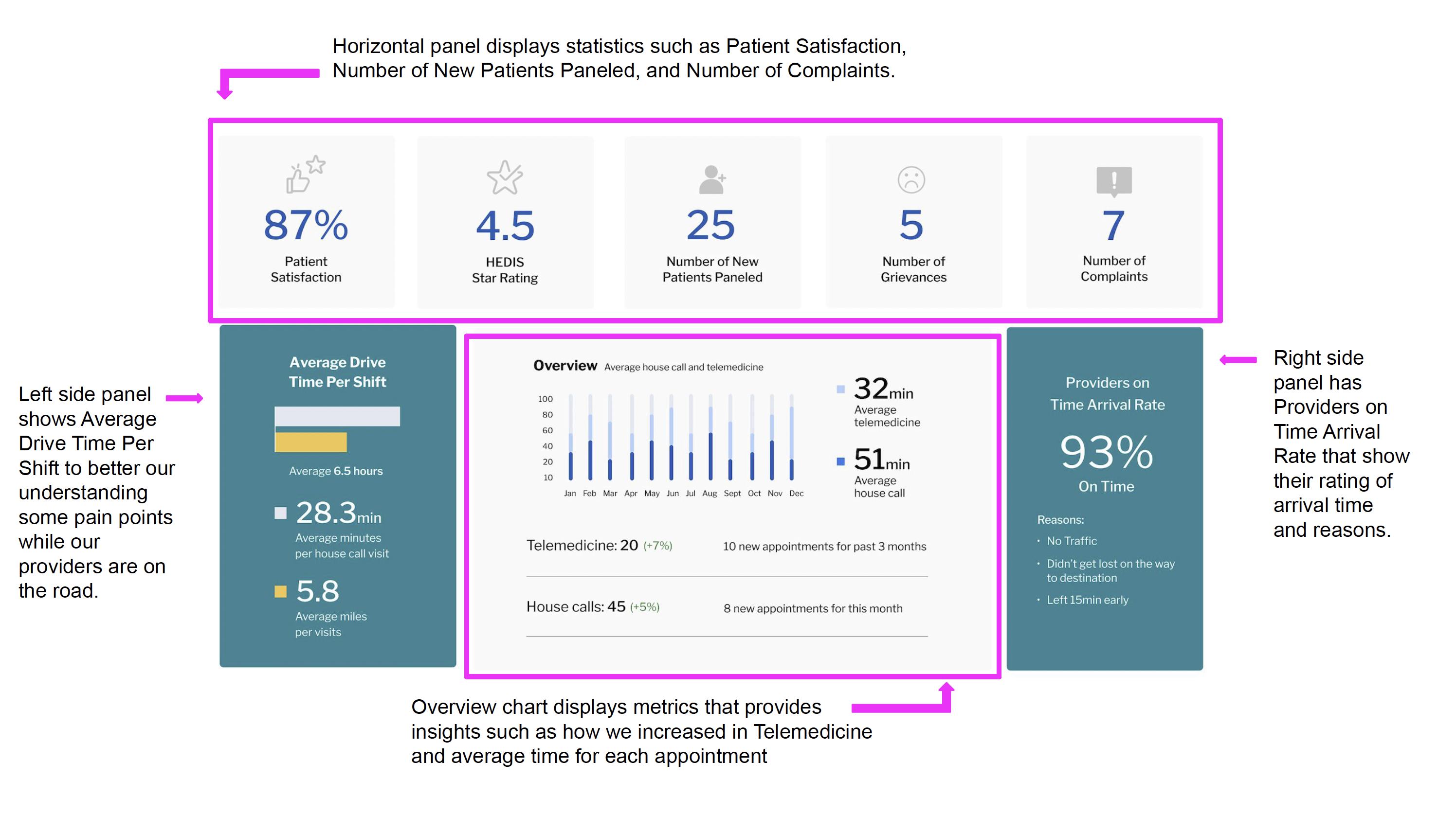
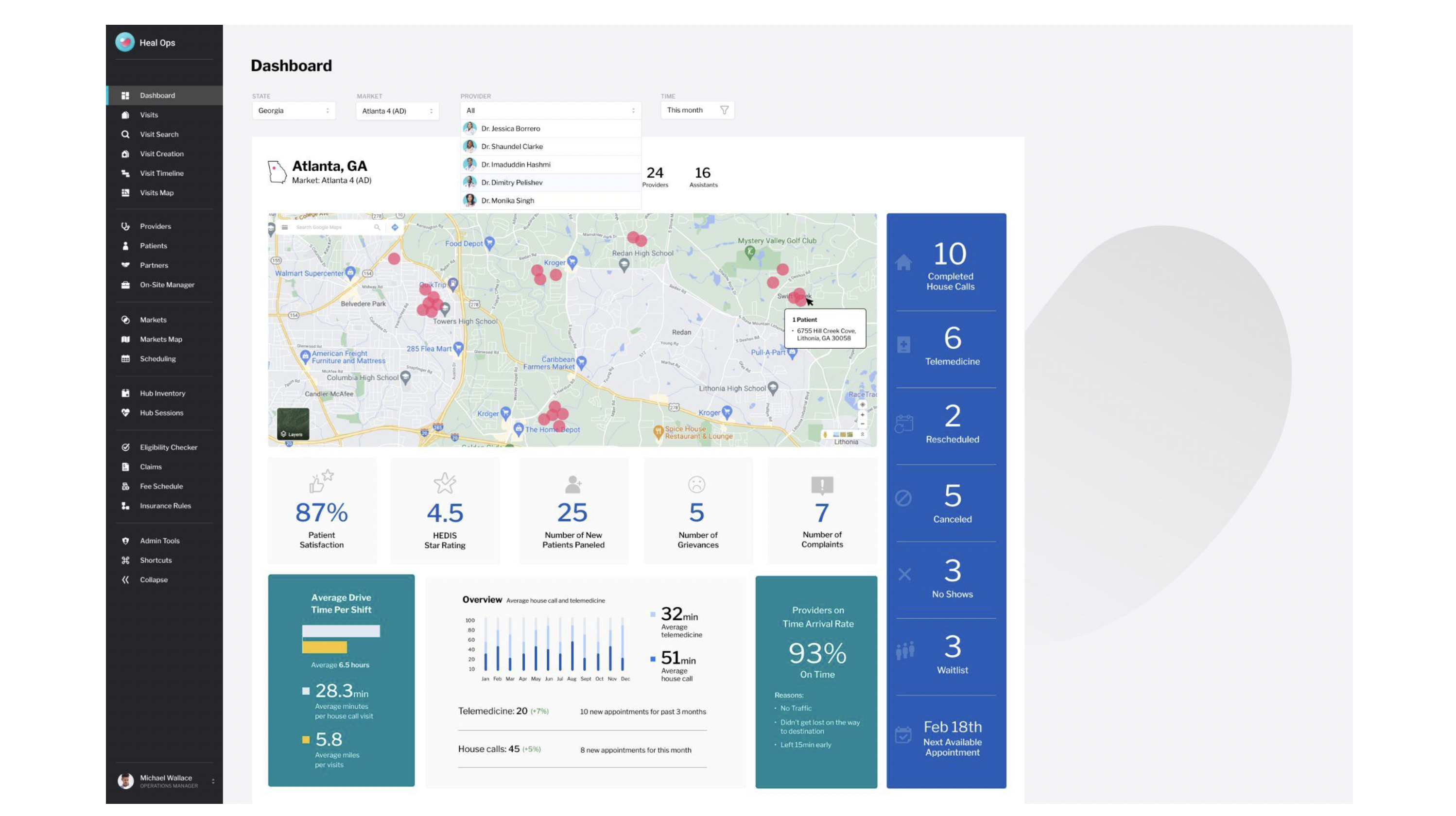
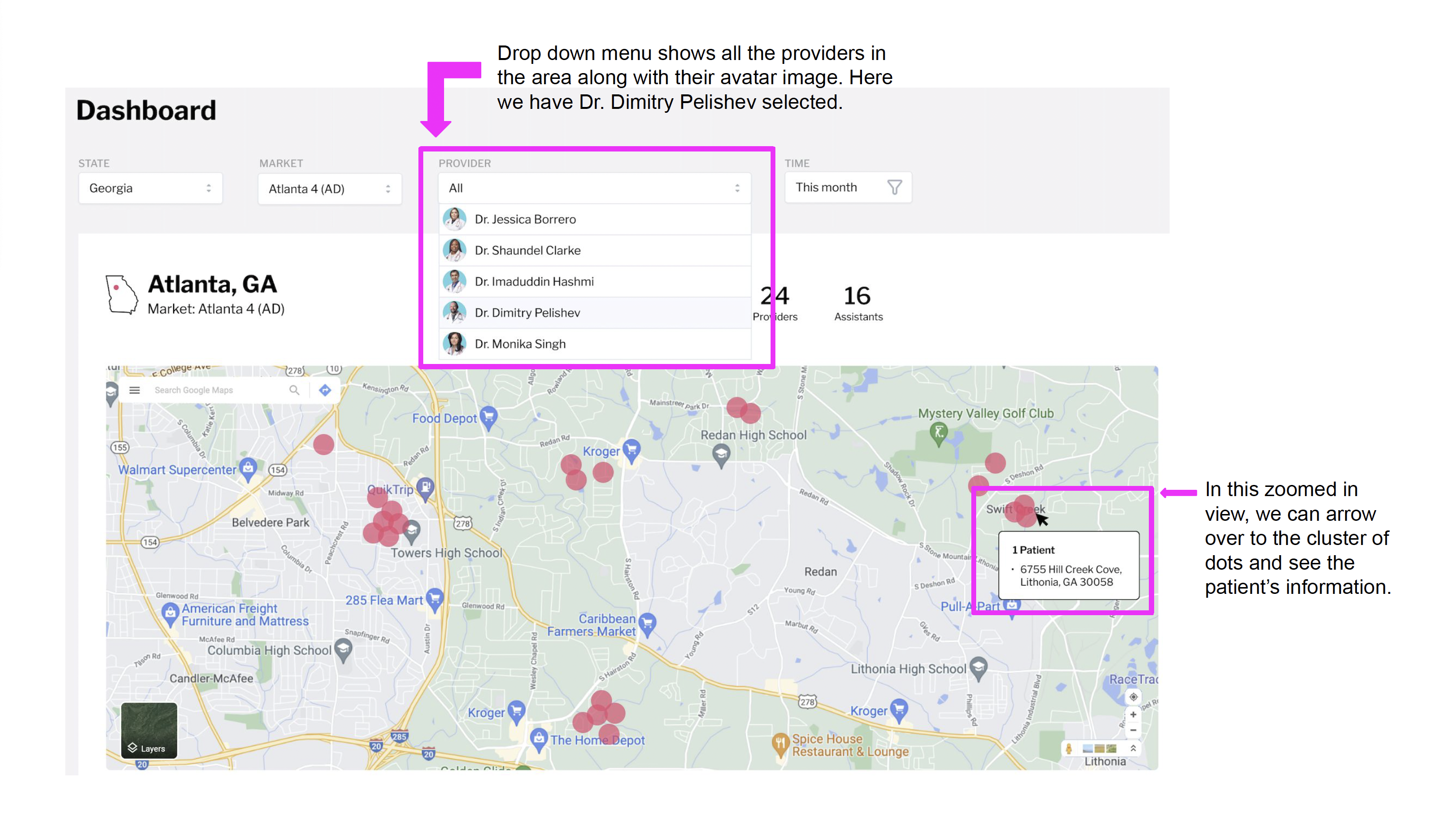
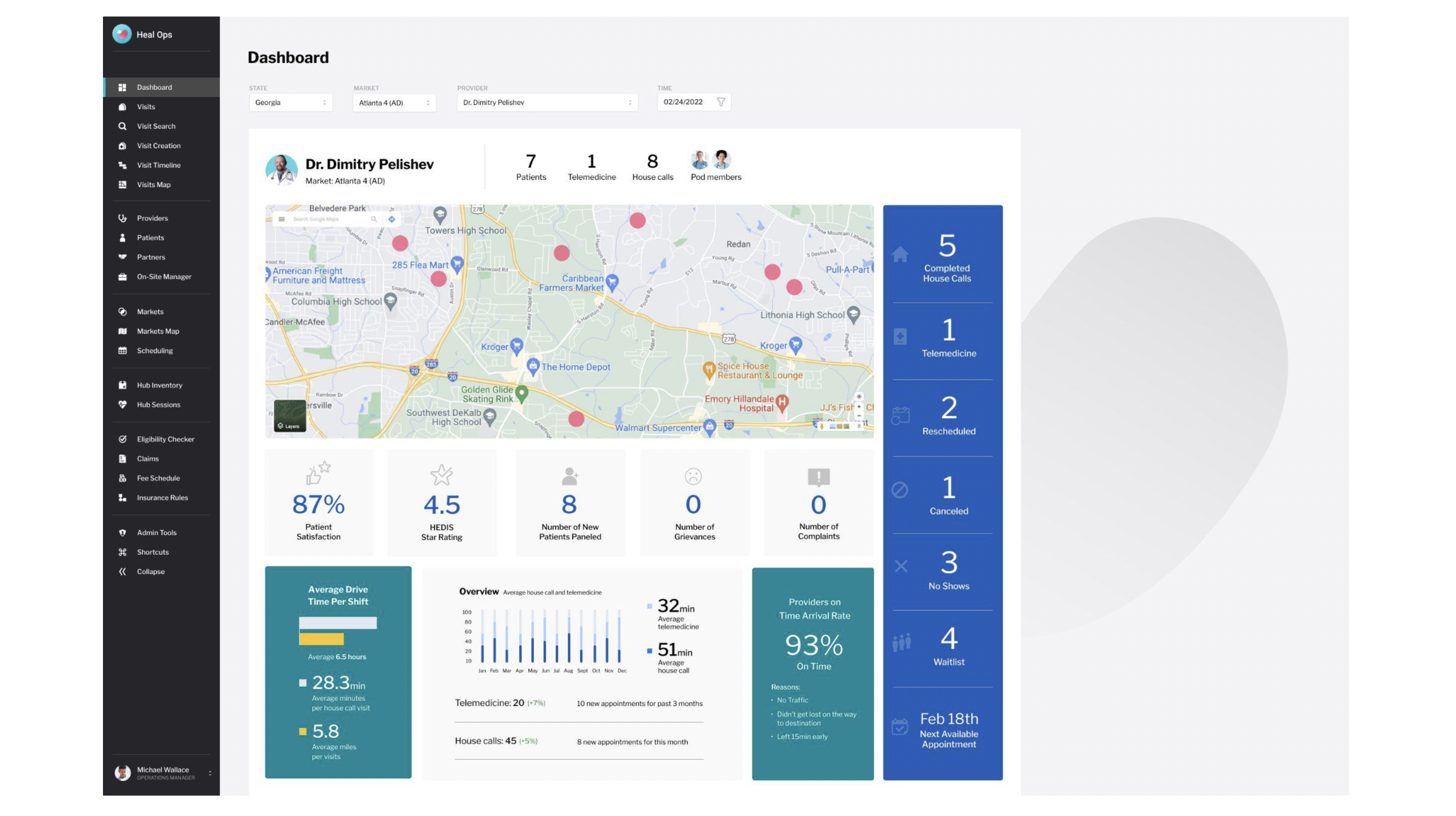
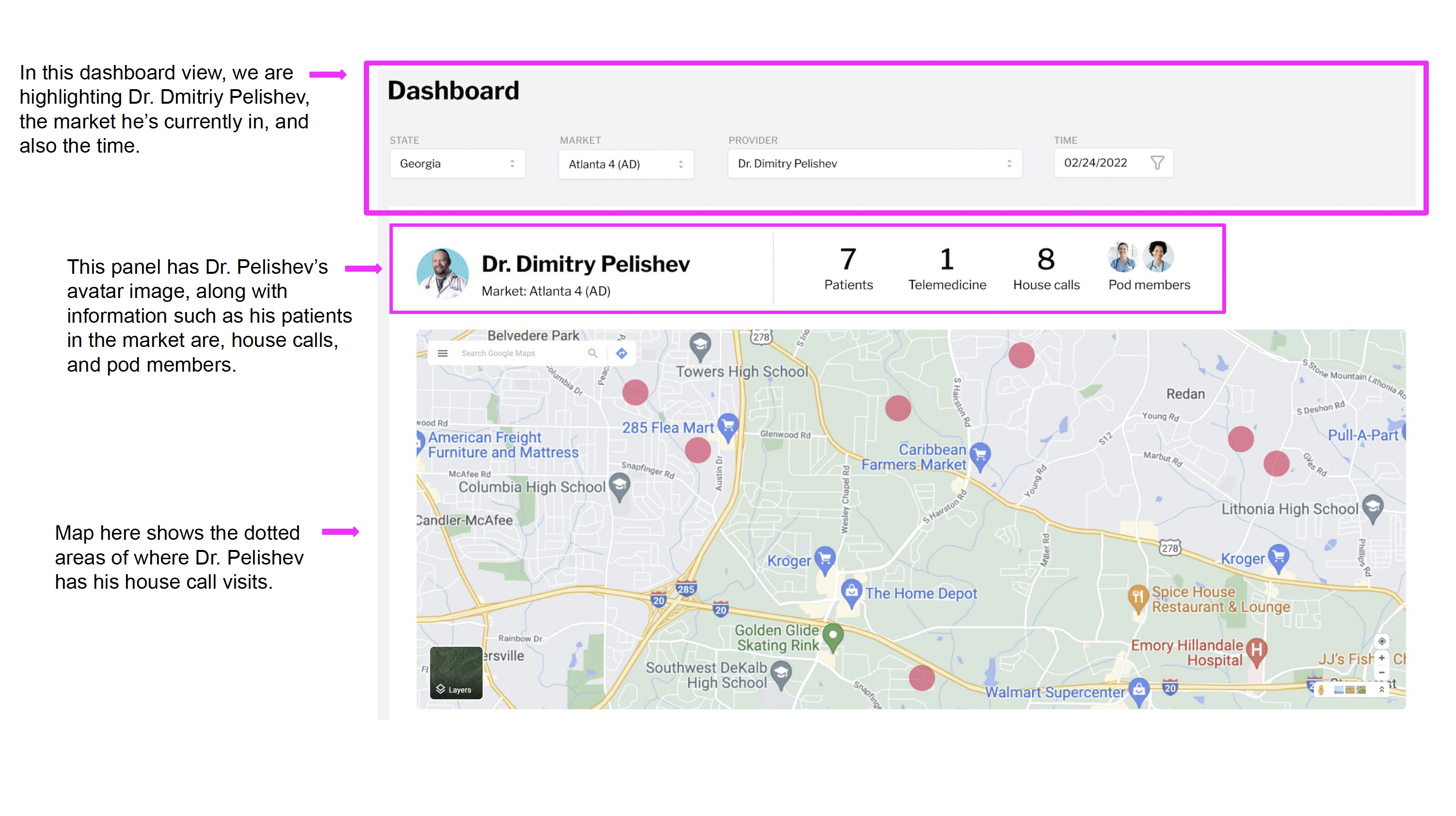
"The dashboard transformed from a static data dump into a dynamic command center. Operations coordinators could finally see their entire market at a glance and drill into individual providers with a single click."
Walkthrough
The redesigned experience in action
This demonstrates the complete new redesign of our navigation panel.
Outcomes
From scattered tools to a unified operations platform
The Heal Ops redesign consolidated fragmented workflows into a single, coherent experience. Operations coordinators who previously toggled between 10+ applications could now manage providers, track visits, monitor analytics, and handle scheduling from one dashboard. The navigation reorganization alone eliminated the friction of scanning through 20+ ungrouped items to find basic functions.
The data visualization overhaul gave the team real-time visibility into metrics that previously required manual spreadsheet compilation: drive times, arrival rates, telemedicine trends, and patient satisfaction. Provider-level filtering enabled coordinators to quickly assess individual performance and make scheduling decisions in real time.
Navigation Overhaul
Reorganized 20+ flat navigation items into logically grouped sections. Added collapsed/expanded states, global search, and role-based user context.
Dashboard Intelligence
Built filterable dashboards with geographic maps, provider stats, drive time analytics, and telemedicine trends. Individual provider drilldown with a single click.
Design System from Scratch
Created the complete UI style guide: color palette, typography, icons, and component library covering lists, tables, filters, cards, maps, and status indicators.
Workflow Consolidation
Reduced reliance on external tools (Google Sheets, Zingle, DrChrono) by integrating key data and actions directly into the operations dashboard.
Tools and Methods
Interested in working together?
Let's team up and create something worth clicking.