All Projects
Design Systems Kenvue (formerly Johnson & Johnson)

Kenvue White Labeled
Design System

Building a modular, white-labeled design system that serves 40+ consumer health brands across 129 global markets. One system, infinite brand expressions, 50% faster production.
Role Sr. UX/UI Designer
Duration 12+ Months
Team Design, Engineering, Product
Tools Figma, Storybook, Contentful
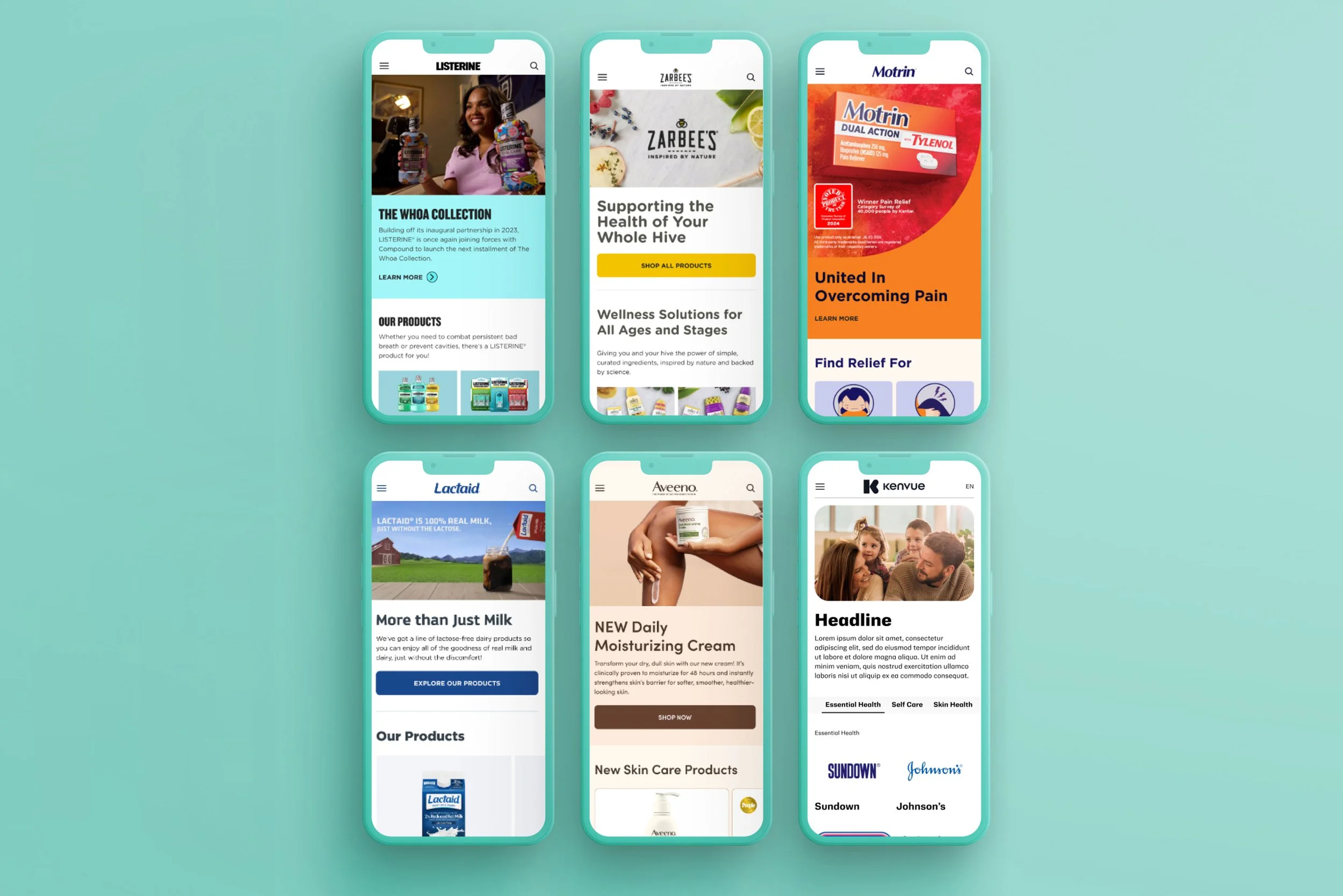
Kenvue design system overview showing multiple brand websites including Listerine, Zarbee's, Motrin, Lactaid, Aveeno, and Kenvue rendered on mobile devices
40+
Global Brands Served
97
Components Built
50%
Faster Production
129
Markets Worldwide

40+ brands, zero shared language

After Kenvue spun off from Johnson & Johnson, the company inherited dozens of consumer health brands, each with its own design patterns, component libraries, and production workflows. Tylenol, Neutrogena, Listerine, OGX, Zarbee's, Motrin, and many more were all building digital experiences independently.

Teams across different markets were duplicating effort, producing inconsistent user experiences, and lacking a shared foundation for accessibility compliance. Every new brand site started from scratch, costing weeks of redundant design and development work.

The mandate: build a single, flexible design system that could white-label across every brand while preserving each brand's unique identity. It needed to work across 129 markets, multiple CMS environments, and teams with varying levels of design maturity.
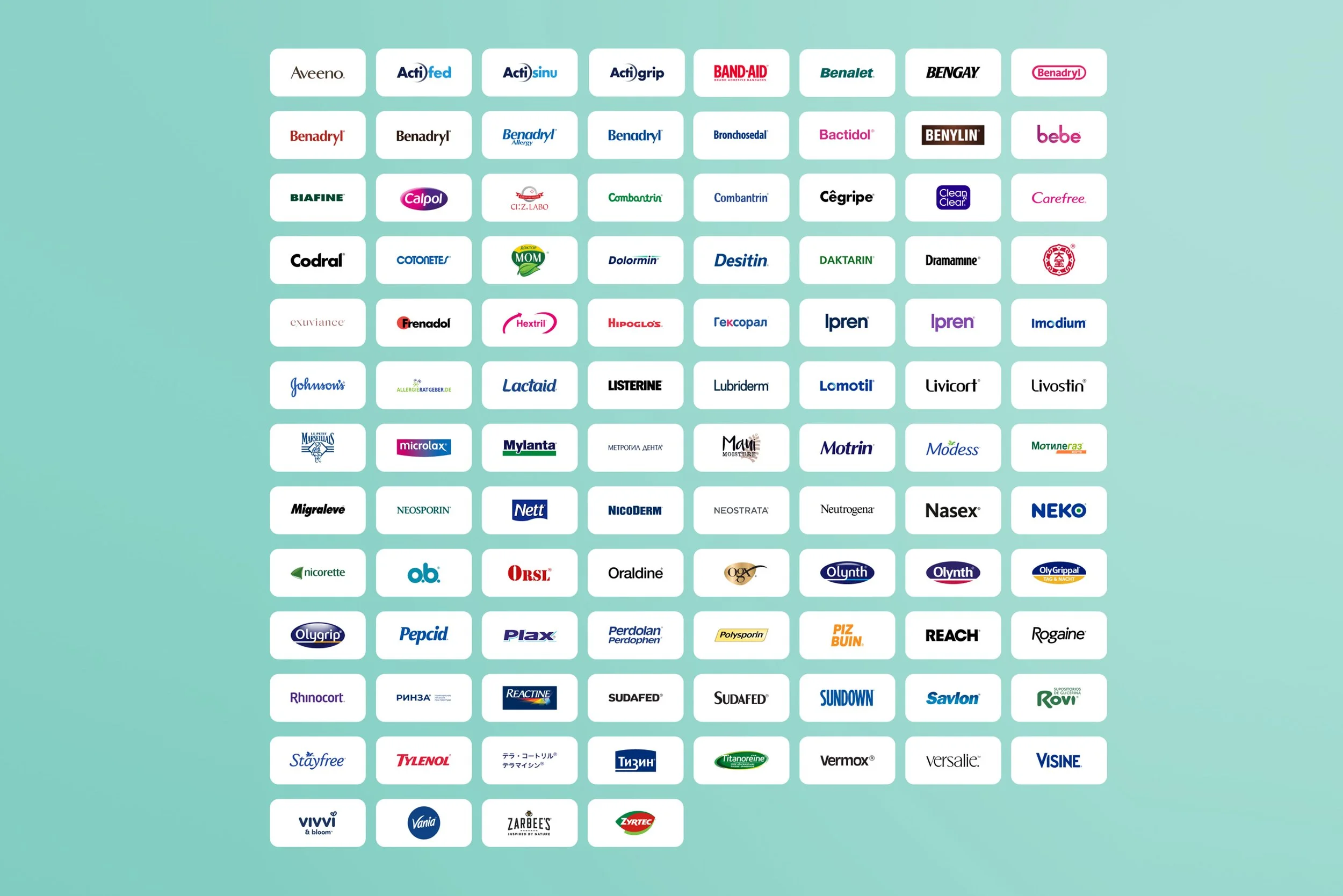
Grid of 100+ Kenvue brand logos including Aveeno, Band-Aid, Bengay, Benadryl, Listerine, Neutrogena, Tylenol, OGX, Zarbee's, and many more
The full scope: 100+ brands across consumer health, beauty, and wellness that the design system needed to support

A system built for flexibility at scale

The system needed to be structured enough to enforce consistency but flexible enough to express 40+ distinct brand identities. I led the UX/UI design across four interconnected phases, working closely with engineering and product to ensure design-to-code parity at every step.
01
Audit and Taxonomy
Catalogued existing components across all brand sites. Identified overlapping patterns, unique brand requirements, and accessibility gaps. Created a shared taxonomy that all teams could reference regardless of market or language.
02
Token Architecture
Designed a multi-tier token system: global tokens (spacing, type scale) flow into brand tokens (color, typography) which feed into component tokens. This allowed any brand to "skin" the system while preserving structural consistency.
03
Component Library
Built 97 components in Figma with 1:1 parity in Storybook. Each component supports multiple states, responsive breakpoints, and accessibility requirements out of the box. Every component was reviewed against WCAG AA standards before release.
04
Governance and Adoption
Created contribution guidelines, documentation templates, and a review workflow. Trained regional teams across the UK, Brazil, Japan, and more on using the system with Contentful CMS integration for content management.
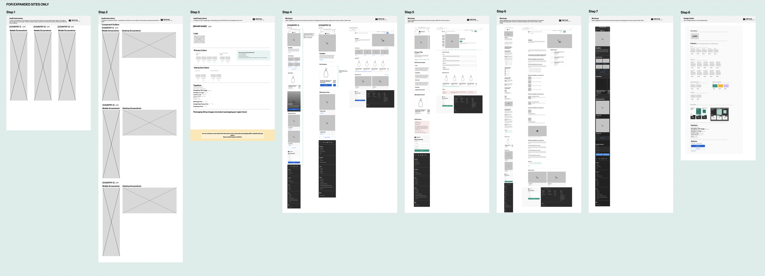
Eight-step site expansion process showing progression from initial audit through wireframes, brand guidelines, mockups, component design, responsive layouts, and final design system documentation
The 8-step site expansion process used to onboard each new brand into the design system

97 components, infinite brand expressions

The library spans navigation, forms, content blocks, media modules, and commerce components. Each one supports light and dark modes, multiple density options, and responsive behavior across four breakpoints. Rather than a single theme with color overrides, each brand gets a fully resolved token set so Tylenol's system feels like Tylenol, not "generic design system in red."
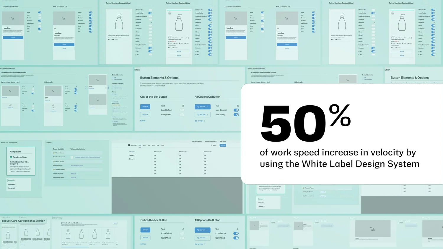
Component library overview showing banners, content cards, category cards, button elements with options, developer notes with tokens, navigation patterns, and a callout highlighting 50% work speed increase
Component library with design tokens, developer handoff notes, and navigation patterns. 50% increase in production velocity.
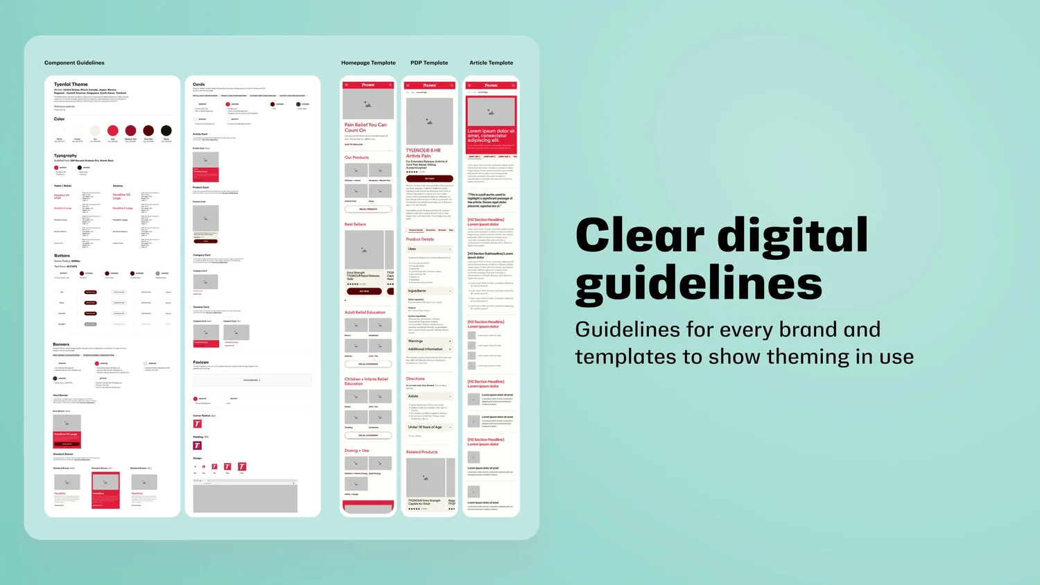
Clear digital guidelines showing component guidelines for the Tylenol theme, card patterns, homepage template, PDP template, and article template alongside the heading: Clear digital guidelines for every brand
Clear digital guidelines: component documentation, page templates, and brand theming all from one source of truth

"The goal was never to make every brand look the same. It was to give every brand the same quality of craft, faster."

From wireframe to production across every touchpoint

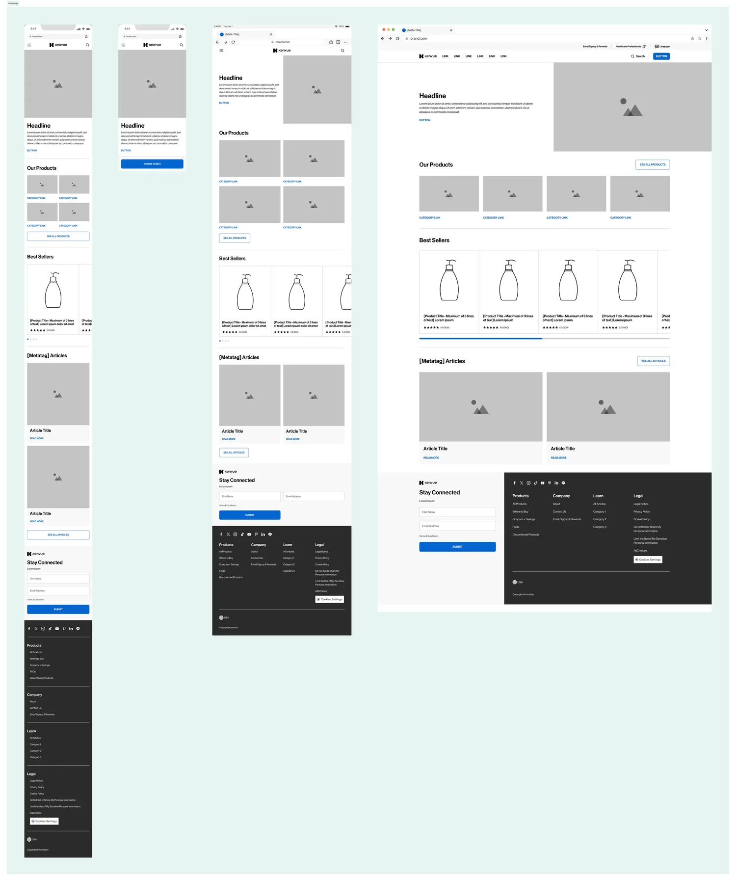
The design system powers every page type: homepages, product detail pages, category pages, article templates, and checkout flows. I designed responsive templates at all four breakpoints (mobile, tablet portrait, tablet landscape, desktop) ensuring the system worked seamlessly from 320px to 1440px+.
Homepage template rendered across four breakpoints: mobile, small tablet, large tablet, and desktop, showing responsive layout adaptations for the Kenvue design system
Homepage template across four responsive breakpoints: mobile through desktop
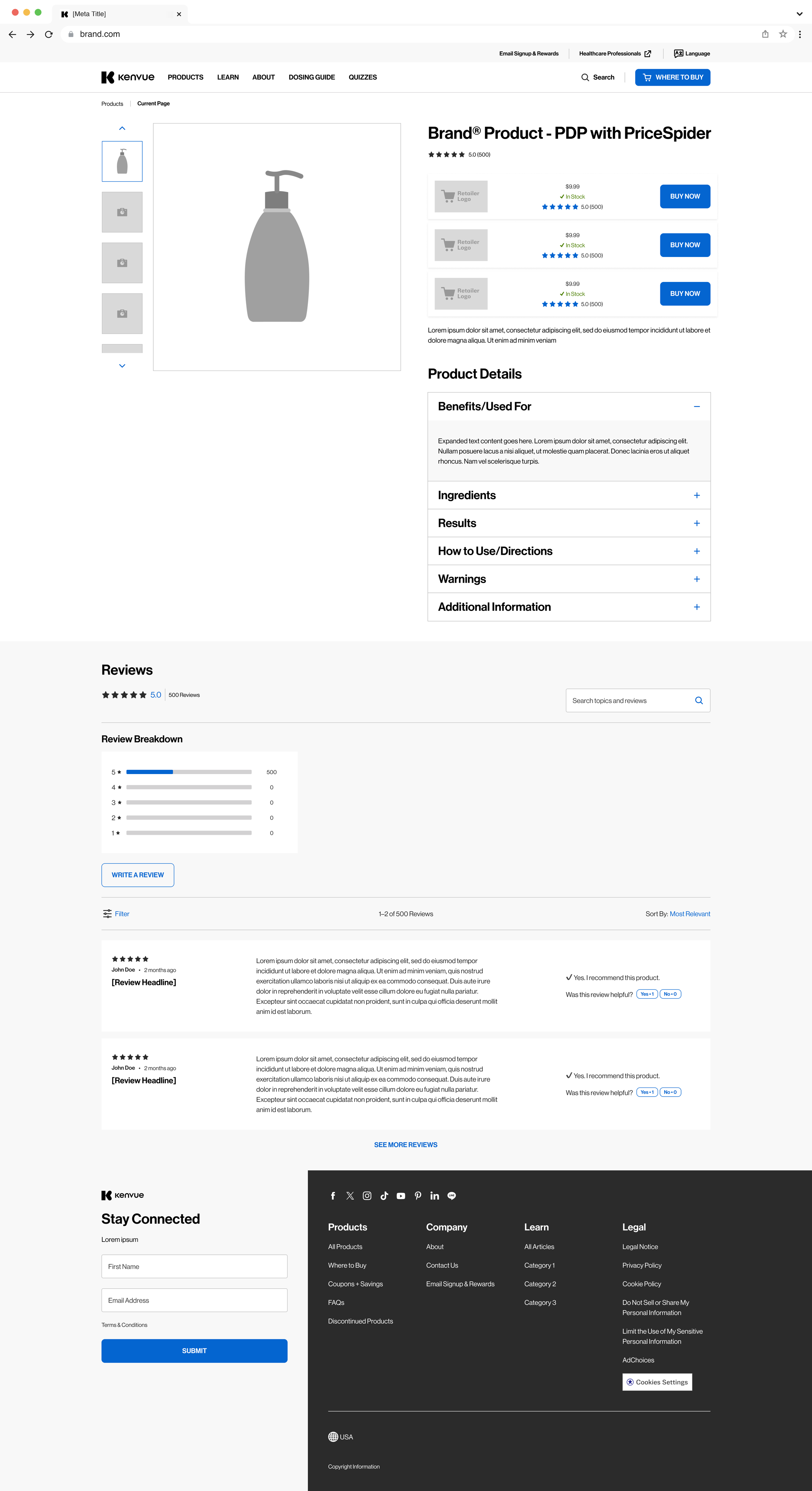
Product detail page design for a Kenvue brand showing product imagery, retailer pricing with buy now buttons, product details with expandable sections, and a reviews module
Product Detail Page with PriceSpider retailer integration
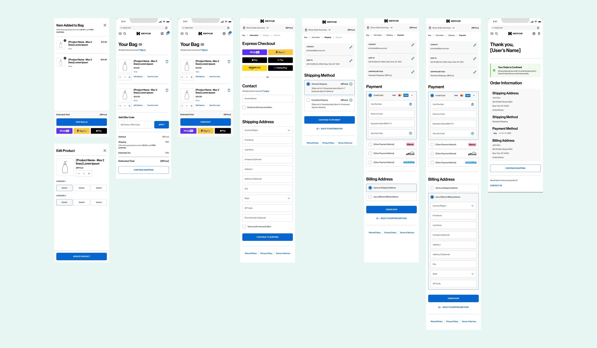
Complete checkout flow showing cart, express checkout, contact and shipping forms, payment with multiple methods, and order confirmation across mobile and desktop
End-to-end order funnel: cart through confirmation

One global design, market-ready templates

I created a unified set of KenvuePro templates that enabled regional teams to launch brand and market landing pages, therapeutic area pages, category pages, and product detail pages without starting from scratch. Each template includes annotated notes for developers, design examples, and clear content requirements so teams in any market can self-serve.
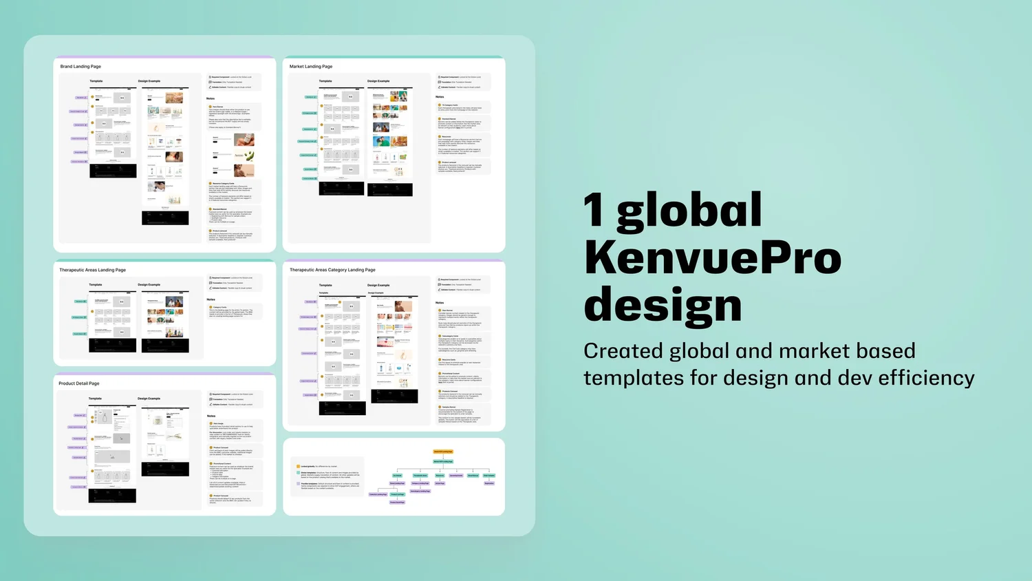
KenvuePro global template system showing five page types: Brand Landing Page, Market Landing Page, Therapeutic Areas Landing Page, Therapeutic Areas Category Landing Page, and Product Detail Page, each with template layouts, design examples, and developer notes
KenvuePro template library: 5 page types with design examples, templates, and annotated developer handoff

WCAG compliance built into every component

Accessibility was a foundation, not a retrofit. Every component in the system ships with WCAG AA compliance: proper color contrast ratios, focus states, ARIA patterns, and semantic markup are enforced at the token level. Brand teams cannot accidentally break accessibility when customizing.

This approach proved its value when OGX Beauty became one of the first brands to fully adopt the system. Their redesign saw bounce rate drop from 49% to 6% and PDP retail exits increase 56% year-over-year, directly demonstrating that accessible design drives business results.
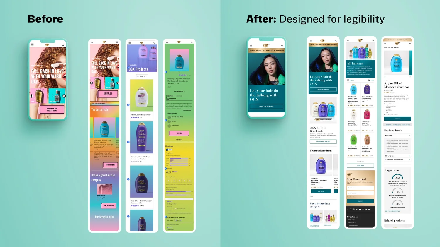
OGX Beauty before and after comparison: the before shows cluttered, low-contrast mobile screens with accessibility issues; the after shows clean, legible redesigned screens with proper hierarchy and contrast
OGX Beauty: Before (cluttered, low-contrast, accessibility failures) vs. After (clean hierarchy, WCAG AA compliant, designed for legibility)

Walking through the system

These recordings demonstrate the design system in practice: how components compose together, how brand theming applies across templates, and how the responsive behavior works across breakpoints.

System walkthrough: component composition and brand theming
Template walkthrough: responsive behavior and page templates

Measurable impact across the organization

Within the first year, the design system fundamentally changed how Kenvue's brand teams operate. Production timelines were cut in half: what used to take a brand team 8 to 10 weeks to build from scratch now takes 3 to 4 weeks using pre-built patterns and tokens.

Accessibility compliance went from an afterthought to a baseline. Because WCAG requirements are enforced at the component level, every new brand implementation ships accessible by default.

The system also created a shared design language across teams that had never collaborated before. Regional designers in the UK, Brazil, and Japan now reference the same components and contribute improvements back to the library. The progressive rollout approach, starting with Tylenol and OGX as pilots, created a feedback flywheel where each brand launch improved the system for the next.

Production Velocity
50% faster workflows across all brand teams. New brand sites go from kickoff to launch in 3 to 4 weeks instead of 8 to 10.
Accessibility at Scale
WCAG AA compliance baked into every component. OGX pilot: bounce rate dropped from 49% to 6%, retail exits up 56% YoY.
Design-to-Code Parity
97 components with 1:1 Figma to Storybook parity. Eliminated "it looks different in code" conversations that consumed sprint cycles.
Global Adoption
129 markets, 40+ brands, and growing. Regional teams now contribute back to the system, creating a self-sustaining design ecosystem.
Figma Storybook Contentful Design Tokens Component Architecture WCAG AA White Labeling Responsive Design Cross-functional Collaboration Design Governance A/B Testing

Interested in working together?

Let's team up and create something worth clicking.

Next Project

OGX Beauty
Accessibility Redesign